Today, we are comparing ColorOS 13 vs MIUI 14, ColorOS is latest UI version of OPPO and OnePlus devices (available under the name OxygenOS 13 on OnePlus) and MIUI 14 also latest UI version by Xiaomi. As you might already know, OxygenOS 13 has exact same user interface as ColorOS 13. In this article, there are pictures from OxygenOS, and we will make a thorough comparison between ColorOS 13 vs MIUI 14. Users of OnePlus/OPPO and Xiaomi/Redmi can compare both interfaces and brands in detail.
ColorOS 13 vs MIUI 14 Comparison
ColorOS 13 delivers a smart, connected, and worry-free experience, using a vibrant design language for vitality, comfort and simplicity. And MIUI is one of the most popular UI for Xiaomi devices. Vibrant UI, diverse personalization options, and useful features make MIUI intuitive and user-friendly. Both interfaces have their own strengths and weaknesses. So, let’s start the comparison.
Lockscreen & Homescreen
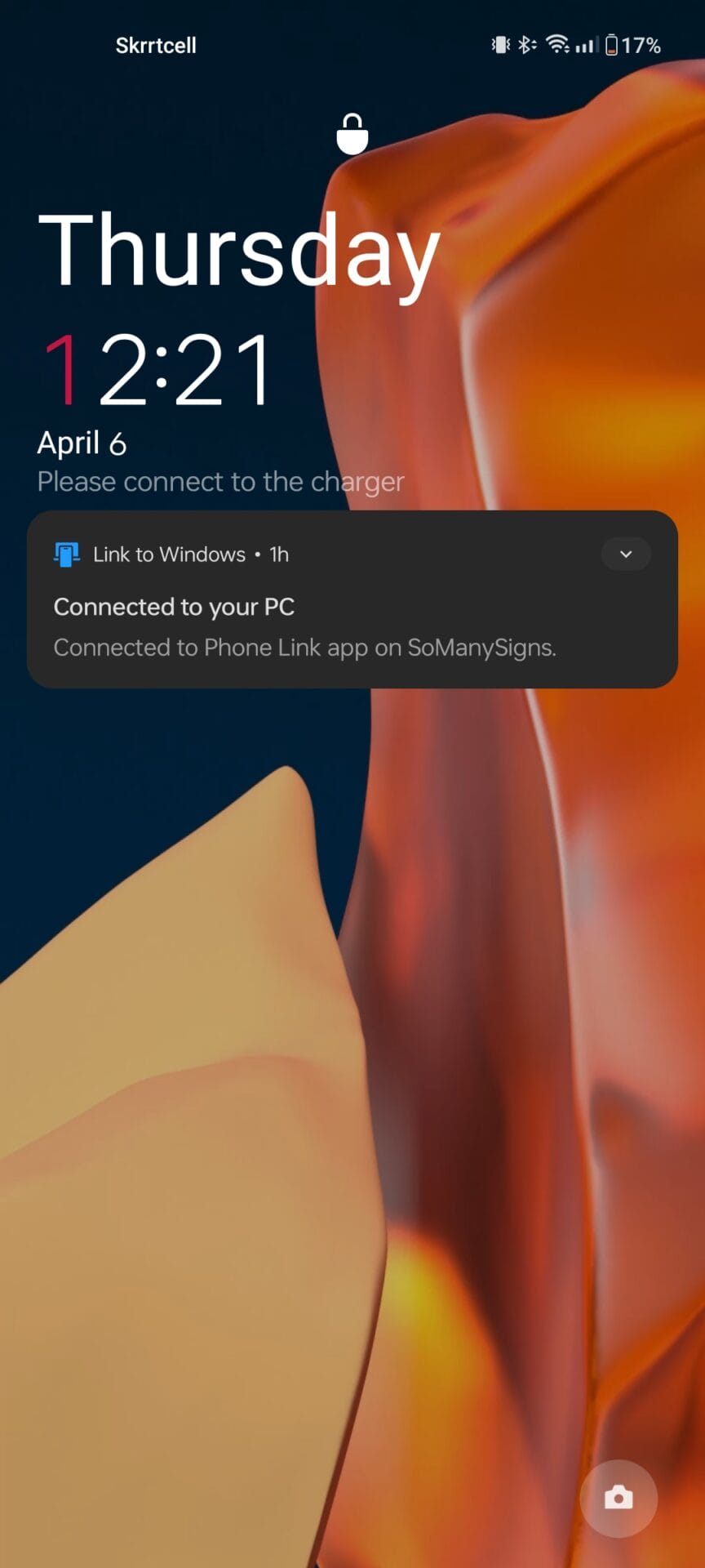
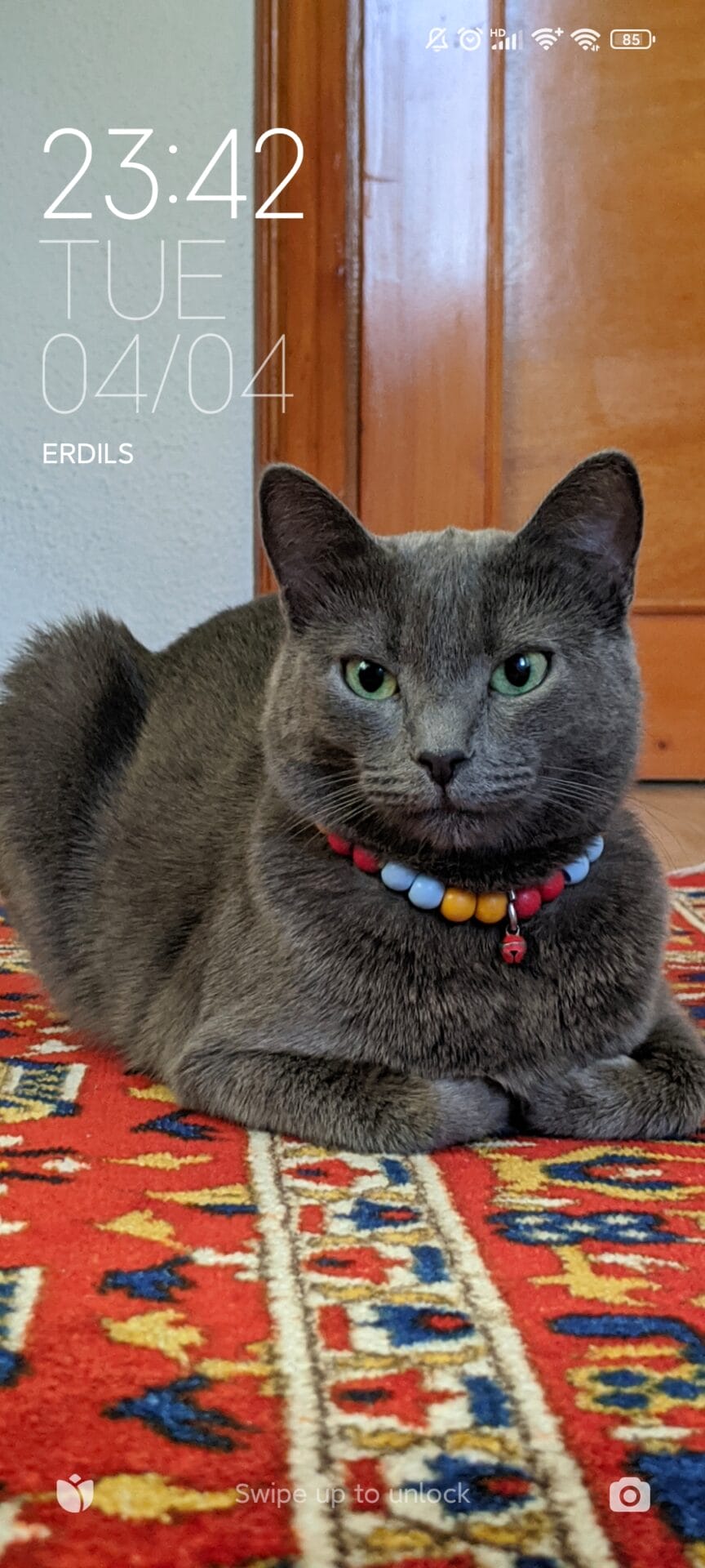
When you pick up a smartphone, firstly you see are lockscreen and homescreen. That’s why we’re starting our comparison of ColorOS 13 and MIUI 14 from this aspect. Both interfaces are stylish, compact, and simple. ColorOS 13 features a minimal red and white time/date display on the lockscreen, justified to the top left, while MIUI 14 has a similar time/date display. Status bar, lock icon, and other icons also have a similar appearance in both interfaces. Sizes of status bar icons are better adjusted in MIUI 14.
On the homescreen, users encounter a stylish design in both interfaces. ColorOS 13 and OxygenOS 13 has same AOSP (Android Open Source Project) style homescreen for a considerable period, featuring the “Never Settle” date/time widget at the top instead of Google’s “At a Glance.” App icons have a rounded square design that can be changed, and an AOSP-style homepage layout is available. Additionally, this version offers “Monet Engine/Themed Icons,” which were introduced in Android 12, and make application icons dynamic according to the system theme.
There is also the app drawer, a feature that does not come by default in MIUI. ColorOS 13/ OxygenOS 13 also has themed icons support in the app drawer. You can search for applications alphabetically with the scroll bar.
MIUI homescreen has a more original and unique appearance. Unlike ColorOS interface, MIUI doesn’t have a default app drawer, but it can be enabled manually. Applications are lined up on the homescreen, and MIUI is also ahead in widgets. Another exclusive feature of MIUI is the “App Vault.” This menu appears when you swipe left on the homescreen, and it contains various device-related settings and application shortcuts, such as weather, news, and device-related shortcuts and this menu is quite useful. Our comparison between ColorOS 13 vs MIUI 14 continues with notification panel/control center.
Notification Panel, Widgets, Styles & Wallpapers
Other aspects that you encounter in daily usage include the notification panel, widgets, styles and wallpapers. This is the part that adds color to the interface, and here we will compare the important customizations and design features in both interfaces.
ColorOS notification panel/control center have a simple and compact design. Icons resemble a combination of AOSP 11 and AOSP 12, with the Wi-Fi and Bluetooth icons coming from the control panel that accompanies the new Android 12 and Android 13. Other icons follow the default circular icon style of Android 11. ColorOS notification panel and control center also feature a useful tab that enables device management, as well as a brightness slider and an auto-brightness option.
Meanwhile, MIUI 14 notification panel/control center have a more iOS-like design, and look more stylish than ColorOS. This design was introduced with MIUI 12, with minor adjustments made in subsequent updates. Same buttons are available, but the layout differs. For smart home products, there is a connection control button below and a music player tab. Icon locations can be changed and edited in both interfaces, and there is also a direct button to the settings. Our comparison between ColorOS 13 vs MIUI 14 continues with widgets.
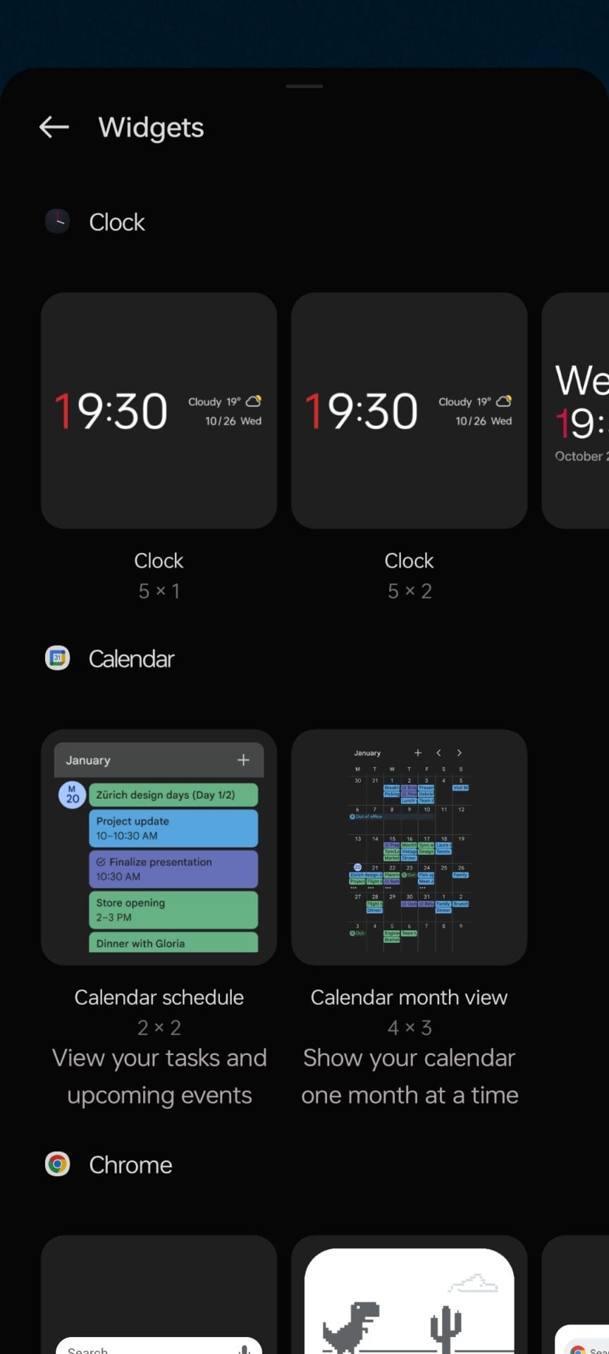
Widgets are one of the features that affect the user experience of Android devices the most, widgets that have been on all Android devices for many years are also available in ColorOS and MIUI. Both interfaces have their own stylish and beautiful widgets, widgets can be added to homescreen according to the aspect ratio. Below are the ColorOS and MIUI widgets. Our comparison between ColorOS 13 vs MIUI 14 continues with styles & wallpapers.
Of course, most effective way to customize a device is through styles & wallpapers. Android devices are mostly personalized and stylized through this feature. Both ColorOS and MIUI have impressive wallpapers and themes. In the ColorOS 13 version, there are impressive wallpapers, fonts, icons, icon shapes, AOD (always-on-display) customization, and monet theme engine customization available in styles & wallpapers section. Additionally, various wallpapers, including live wallpapers, can be set.
MIUI 14 is an interface that is rich in customization options. In the styles and wallpapers section, the lock screen time format, icon style, fonts, AOD (always-on-display) customization and stock/live wallpapers library are available. MIUI is extremely rich in theming because custom theme support is available, and themes created by communities can be downloaded and installed on the device. Therefore, you can shape your device in anyway you want. Our comparison between ColorOS 13 vs MIUI 14 continues with stock system apps.
Stock System Applications
Another factor to consider in our comparison of ColorOS 13 vs MIUI 14 is their stock system apps. Applications such as Camera, Contacts, Dialer, and Messages are specific to the device interface, which is why they should be included in our comparison.
While ColorOS system applications are unique, they are essentially based on Google’s system applications. For example, the camera application is the stock camera application available on OnePlus/OPPO devices, while the Messages and Contacts/Dialer applications are provided by Google, specifically Google Messages, Google Contacts, and Google Dialer, which are used on Pixel devices.
In contrast, MIUI is more complex in this regard, as its system applications vary depending on the region. For instance, there are no Google applications in the MIUI versions used in China, Indonesia, and Taiwan, and the system applications are completely provided by MIUI (such as MIUI Messages, Contacts, Dialer, etc.). However, in MIUI Global, EEA, and other MIUI regions, Google’s system applications are predominant. Detailed information on this subject is available in our article here. Actually this region thing is also available on OPPO & OnePlus brands. Rest of our ColorOS 13 vs MIUI 14 comparison will consist of system settings and other specific features.
Device Settings, Exclusive Features and More.
Remainder of our comparison between ColorOS 13 vs MIUI 14 will focus on their system settings and other features. All other features of devices will be included in this section. Both interfaces offer a variety of high-end features for their devices. In addition, all the remaining customizations are in this section.
When we examine the settings section of ColorOS 13, we can see that all the settings are available here. At the top, there is the OPPO/OnePlus Account section. By logging in to your account here, you can sync all the settings related to your device and more. In the connection section, you can find Wi-Fi, Mobile Network, Bluetooth, and other connection settings. Below that, there are the styles & wallpapers, lockscreen/homescreen, display, and sound settings that we mentioned earlier. You can find more details in pictures below.
MIUI 14 offers the same settings, as device settings cannot vary much across most devices. The Mi Account section is located at the top, and by logging in to your Mi Account, you can synchronize your entire Xiaomi ecosystem and device simultaneously, as well as access your cloud storage with Mi Cloud services. Other device settings can be found in other parts, and you can find more information in the pictures above.
Finally, let’s compare the device “Security” and “About Device” sections. Both user interfaces provide detailed device security features. From this section, you can check the security of your device, set up password/fingerprint/face lock, check encryption status, and check security updates.
In the “About Device” section, you can access specific device information, such as the device model number, Android version, ColorOS/OxygenOS or MIUI version, and RAM/Storage information. We have reached the conclusion in our ColorOS 13 vs MIUI 14 comparison.
Both interfaces have their own advantages and disadvantages, but in our opinion, ColorOS/OxygenOS is more stable than MIUI. What do you think about the ColorOS 13 vs MIUI 14 comparison? Which user interface do you think is better? Don’t forget to share your opinion below, and stay tuned for more articles.


