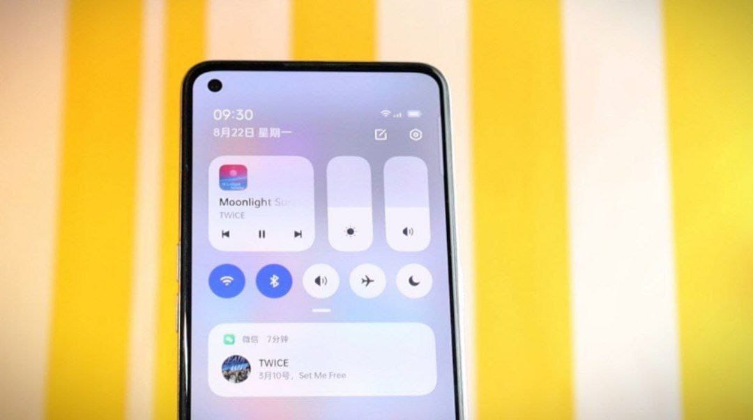
Rumors suggest that the new version of realmeUI might feature a new notification panel. Although the update has not yet been made available on the devices. OnePlus and realme devices have already adopted the ColorOS user interface. An image of the upcoming realmeUI version shared on Weibo (Chinese social media platform) shows the brand new notification panel.
New realmeUI notification panel
The most significant change in this new panel is the inclusion of brightness and sound sliders, which is a design concept adopted by Xiaomi inspired by Apple. It is uncertain whether this notification panel will be exclusive to realme devices or whether it will become available on all OPPO devices.
The new notification panel of realmeUI comes with a new modern design. With the notifications having more rounded corners, we can say that it closely resembles iOS.
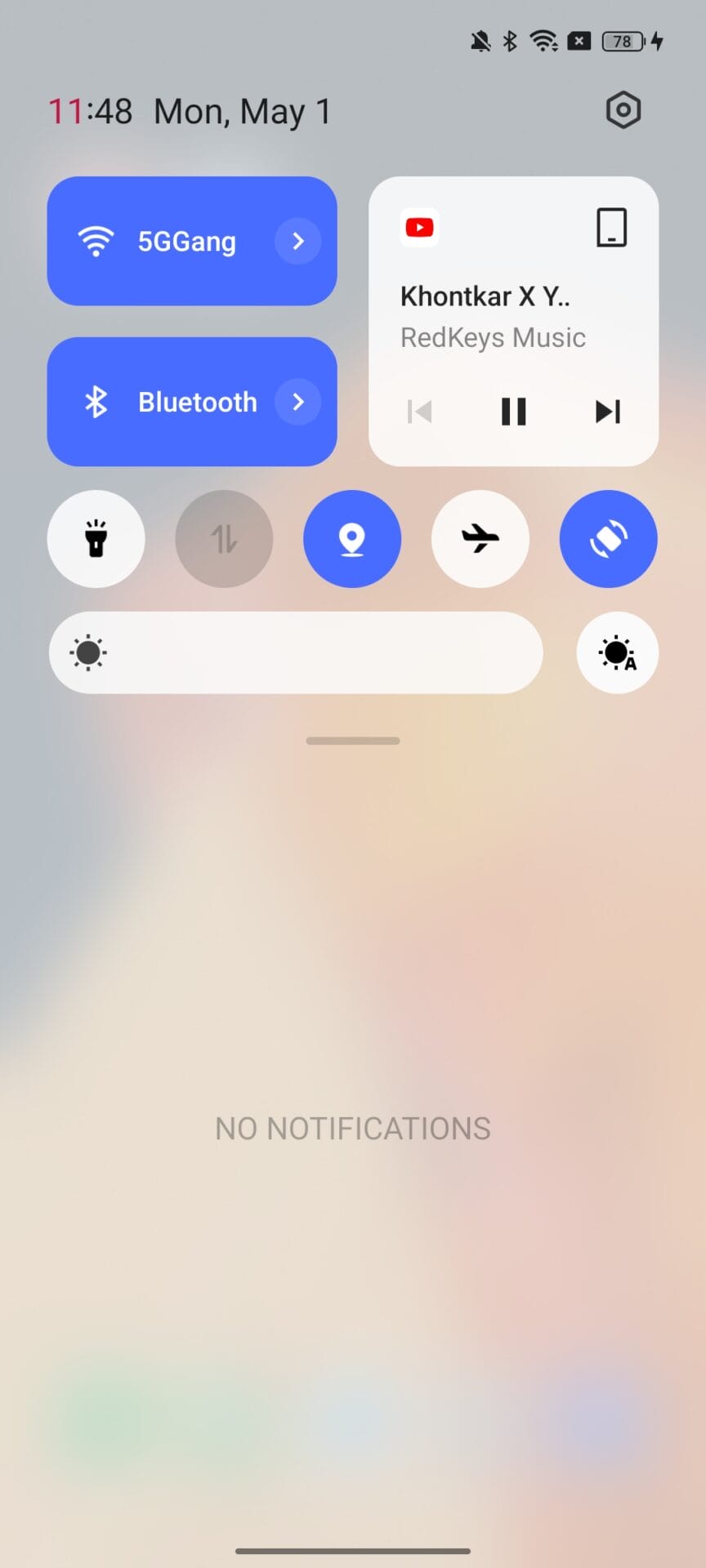
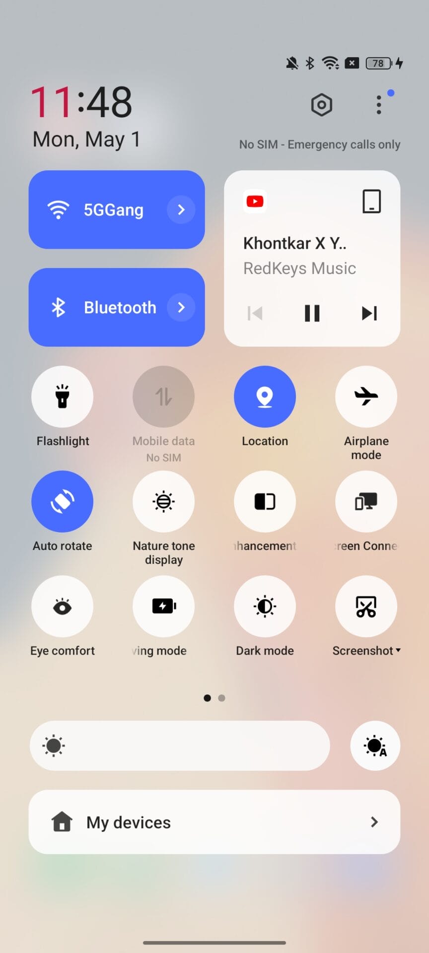
Here is the notification panel of OxygenOS 13.1 for a minor comparison. The circular icons for Wi-Fi and Bluetooth are present on the new notification panel instead of bigger and rectangular ones on old panel, they are replaced by brightness and sound sliders and moved to the right right side of the panel. The media player has been moved from the right side to the left. A noticeable feature is an editing icon appearing to the left side of the settings icon, which could actually allow editing the brightness and sound sliders. On the previous version, this edit icon appears when the notification panel is expanded.
What do you think about new notification panel? Please comment down below!


 Kadir Can Akıncı