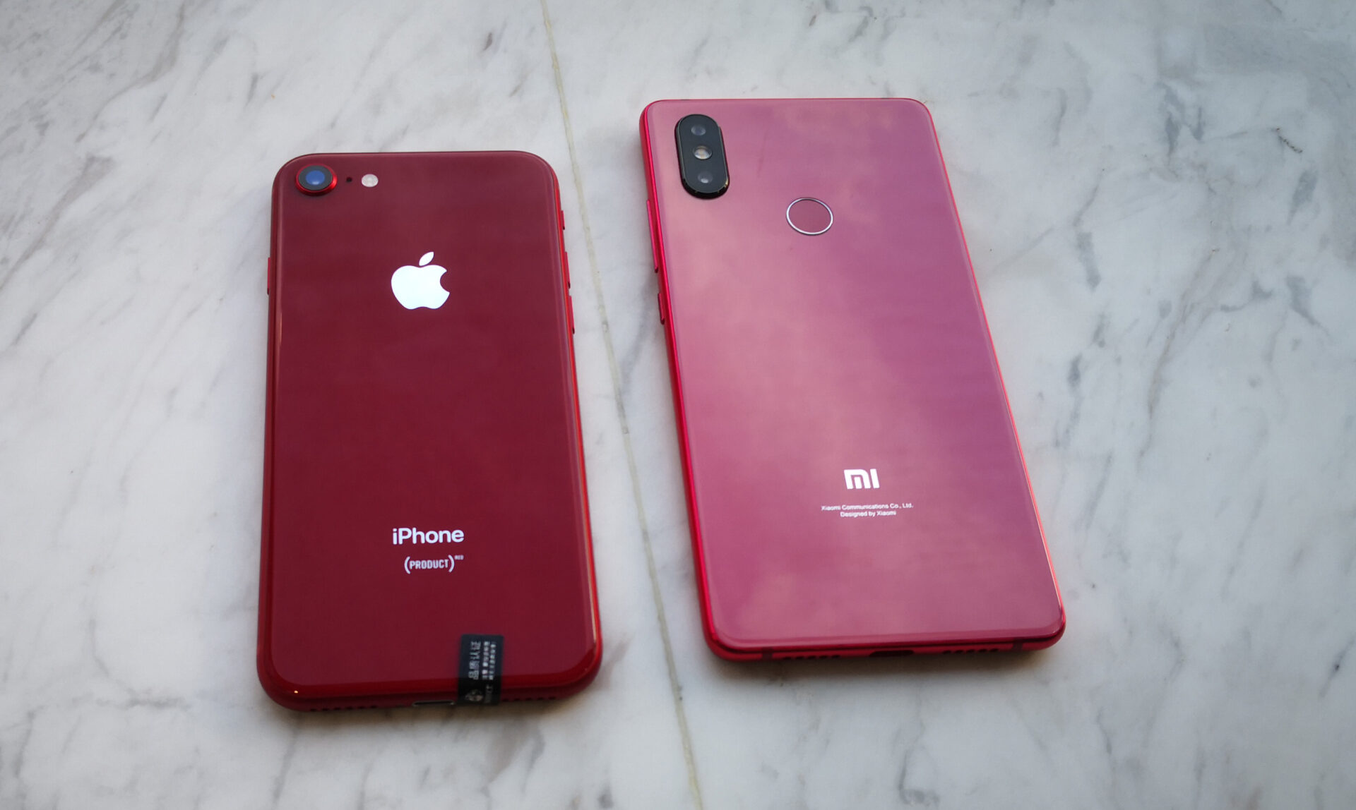
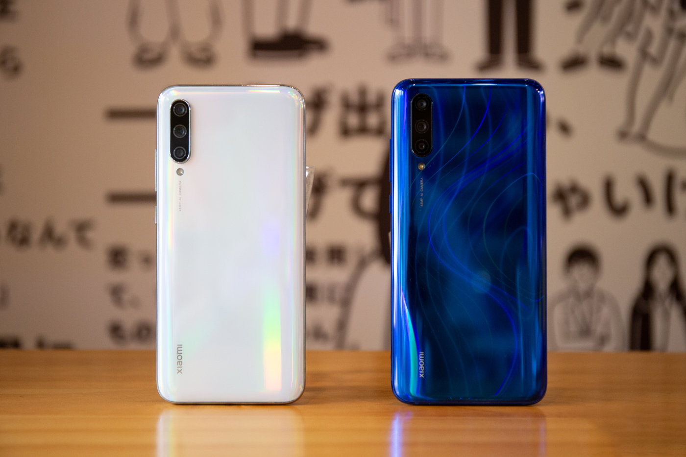
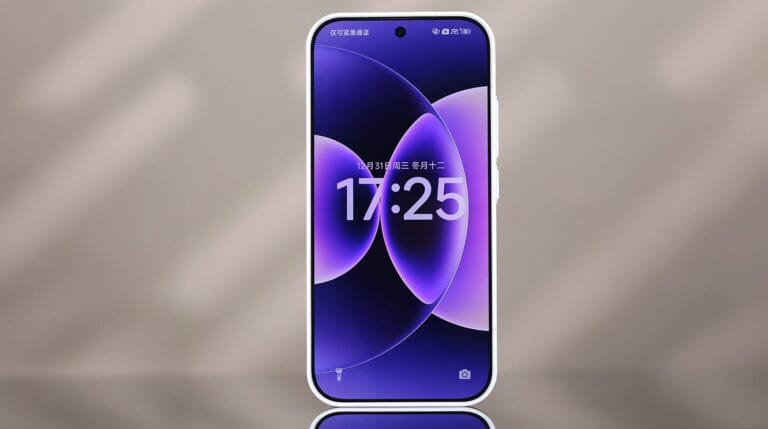
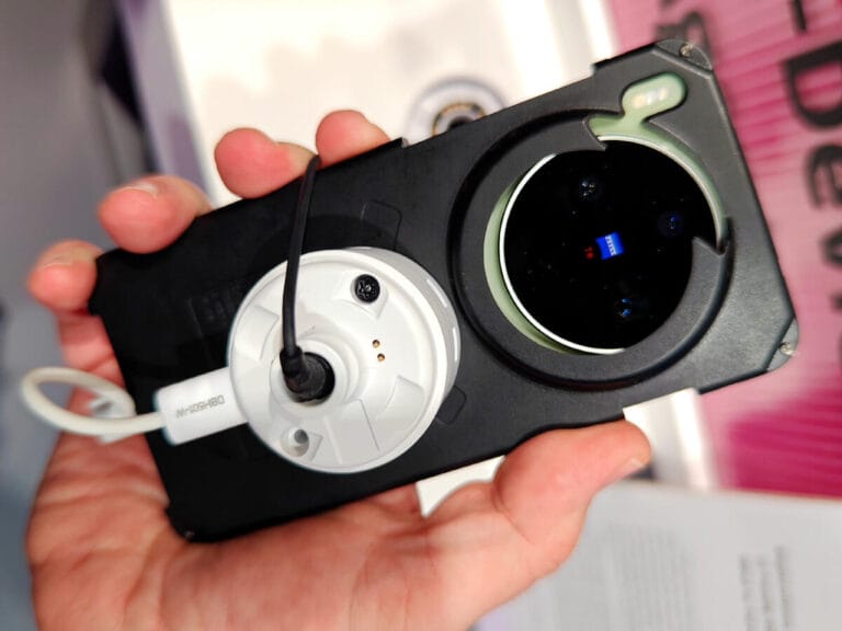
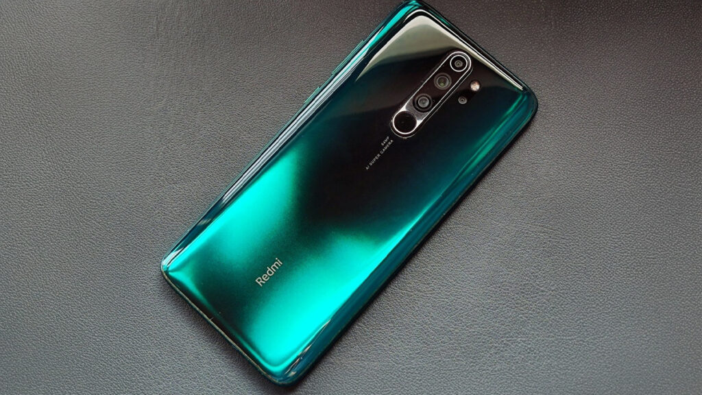
The smartphone industry has always shown tremendous pace in terms of advancement and development, be it in terms of technology and advancements or in terms of design identities. Around 2018-2019, models such as Xiaomi, Redmi, and Mi had come up with some of the most striking and fascinating smartphones that had been produced until then. Examples include Xiaomi Mi A2, Redmi Note 7, Mi 8 SE, and Mi 9, which had striking red colors and mesmerizing gradient finishes that are referred to as the “art of reflection.” Devices during that time, like the Redmi Note 7, were more than just colorful; they sold over 20 million units within the first seven months. But with the evolution of the 12, 13, 14, and soon 15 series from Xiaomi, this colorful trend has gradually disappeared. The answer to that question is more than just a trend; it lies within the depths of a massive market shift that has been spawned by psychology and the new Xiaomi brand ideology.
From Fiery Reds to Elegant Tones: The Maturity of Color
Red was previously linked to energy and uniqueness in the Xiaomi design ethos but later became characteristic of mid-range devices instead. Products such as Redmi Note 6 Pro and Mi 8 SE incorporated energetic red hues to entice more young buyers. However, the “fun” and “playful” strategy started to feel outdated in the higher end segment since more customers began to favor “elegance” over “fun.” Apple’s (PRODUCT)RED initiative was instrumental in redefining the meaning of this color in the sector. Rather than focusing on red as a mainstream color option, Apple chose to highlight it as a Special Edition color that was tied to giving back to society.
Today, red has managed to transition from being one of the mainstream color options to something that symbolizes luxury in the niche sector that Xiaomi operates in. In terms of CMF (Color, Material, Finish) in 2025, there was a trend towards mature colors such as Burgundy and Cherry Red that embody ‘sophistication’ rather than ‘exuberance.’ These colors tend to be less about ‘youthful’happiness and more about ‘embodied
“Reflection Art,” the Era of Minimalism Concludes; “Minimalism Equals Luxury”
The end to gradient finishes and reflective backs is more about the bigger design trend shift. The Mi 9 or Mi 11 models had “reflection art” designs with complex gradients, whereas more recent releases such as Xiaomi 12 and Xiaomi 13 opted for more subtle matte finishes. What constitutes luxury today is the hallmark of minimalism. In fact, research has found that consumers believe that clean lines, neutral colors, and simple surfaces are an indicator of higher quality and more authenticity. Conversely, gaudy designs are subconsciously associated with lower-cost items that are trying to “mask” inferior quality.
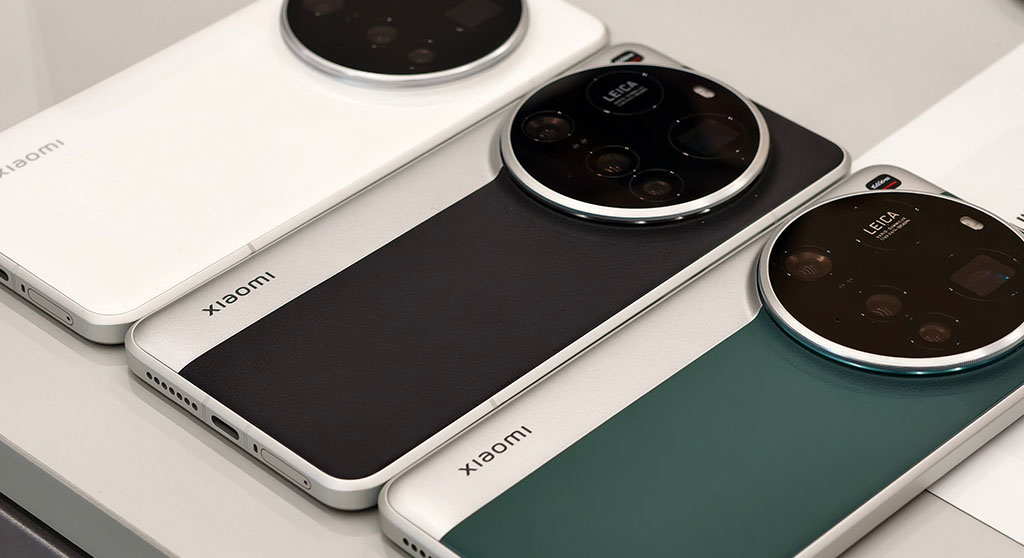
Not to mention that this perfectly correlates with the aim to set the latest devices – particularly Xiaomi 14 and 15 series – side by side with those of Apple and Samsung among others within the elite segment. Then there is Xiaomi’s collaboration with Leica that has further strengthened this move by blending classic camera-inspired minimalism with superior craftsmanship.
Xiaomi and Leica – The Redefinition of High-End Brand Identity
The partnership between Xiaomi and Leica marks one of the most dramatic design shifts that Xiaomi has undergone. The Leica brand has managed to establish itself over one hundred years with its focus on precision engineering and minimalist design. In adapting the Leica design, Xiaomi has had to move away from the gradient colors that defined its brand identity. The impact can be seen in contemporary flagships such as the Xiaomi 15 Ultra, adorned with PU leather finishes, metallic bodies, and camera-oriented designs that take inspiration from Leica’s vintage models. The emphasis has shifted from “how the device shines” to “what the device represents,” symbolizing ‘craftsmanship’ and ‘excellence’ in imaging.
Looking Ahead: The Psychology of Calm Design
In the current world that is visually overstimulated, consumers want to feel calm and comforted rather than visually pleased. This is the reason behind the adoption of wellness-inspired color themes such as Peach Fuzz, Mocha Mousse, and others pastel colors that are more inclined to emotional wellness. A smartphone has shifted from being an ‘excitement device’ to an ‘extension of lifestyle and calmness’. Xiaomi’s current CMF strategy fully adopts this trend. The brand’s move from colored plastic to more mature materials such as matte glass, titanium, and leather constitutes the entire industry’s change to more timeless designs.
The absence of vivid colors in smartphones is rather an indicator of design maturity and has nothing to do with creativity. Xiaomi’s transformation from the colorful Redmi Note 7 to the Leica-designed Xiaomi 15 Ultra is an indicator that the brand has matured over the years.


 Emir Bardakçı