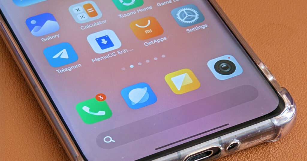
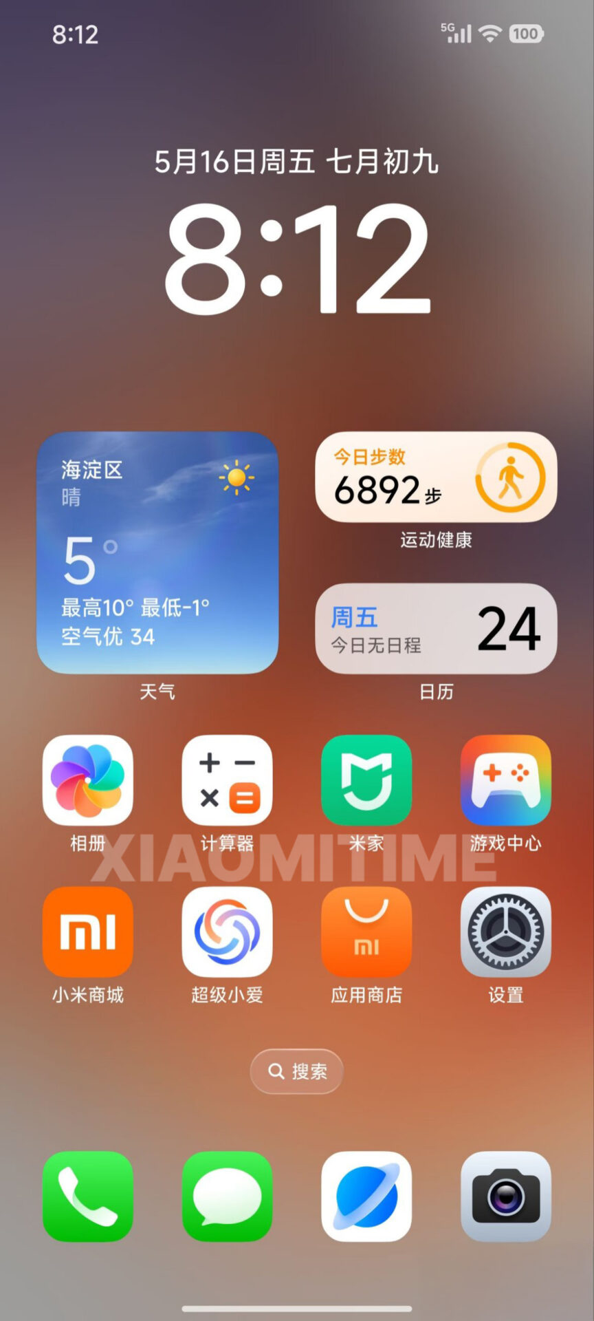
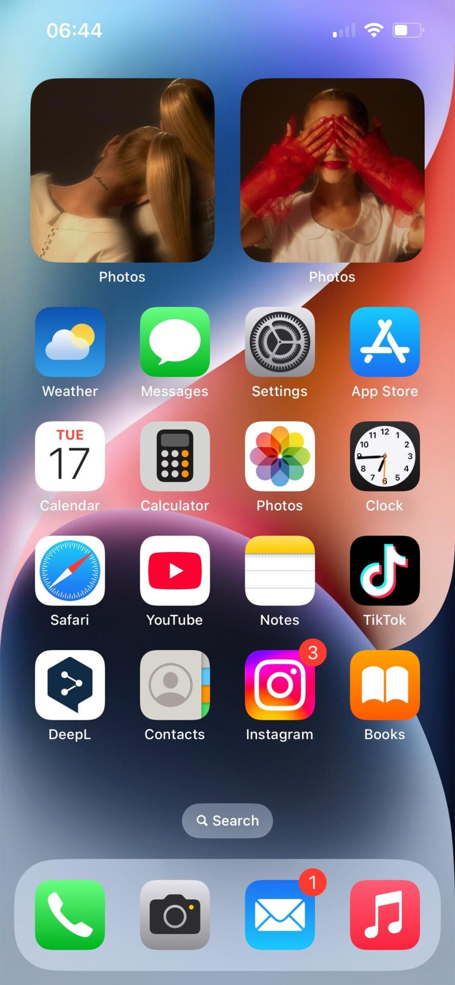
Xiaomi is preparing for a significant refresh with HyperOS 3, and the new icon design language is likely to spark conversation—especially among users familiar with Apple’s iOS. Official preview screenshots reveal that Xiaomi is moving away from its prior understated palette, opting instead for vibrant, saturated app icons reminiscent of Apple’s visual approach. In short: the interface is bolder, brighter, and intentionally on-trend.
Noteworthy Interface Changes
Leaked visuals highlight a clear alignment with prevailing mobile design trends. Core apps like Camera and Gallery now feature more rounded, three-dimensional icons, echoing iOS 18’s style cues. These changes aren’t just cosmetic; the increased color saturation and depth improve visibility and user engagement.
Strategically, Xiaomi has also removed the home screen search bar. This move streamlines the interface, creating a more minimalist experience and freeing up valuable screen real estate for app icons and widgets. It’s a decision that mirrors broader industry shifts toward simplicity and efficiency.
Battery Indicator: Enhanced Clarity
Another notable update is the redesigned battery percentage display, which now mirrors the iPhone’s format. This change isn’t accidental—it’s a calculated effort to adopt widely recognized best practices while still maintaining Xiaomi’s brand identity. The new Glass UI elements, with their translucent, layered effects, add visual sophistication and reinforce a sense of modernity.
Broad Device Support and Rollout Timeline
HyperOS 3 is set to support a wide range of devices:
- 33 Xiaomi models (flagship and mid-range)
- 44 Redmi devices (from entry-level to premium)
- 19 POCO devices (including gaming-centric models)
The update is scheduled for October 2025 and will offer dual compatibility with Android 15 and 16. This dual-platform strategy maximizes the addressable user base and future-proofs the update for both current and upcoming hardware.


 Emir Bardakçı


Pliss Xiaomi,pengen update ke hyperOS 3 apalah hp redmi note 11 gak pernah dapat kemaren hyperOS 2 aj gadapet pplisspppspsososoeosoek cooooooooooooooooooooo
Yeah cool, we don’t want apple icon theme like
my device account update security software installation pls up-to-date system active Xiaomi system support security software installation pls
wallpaper de hyper os