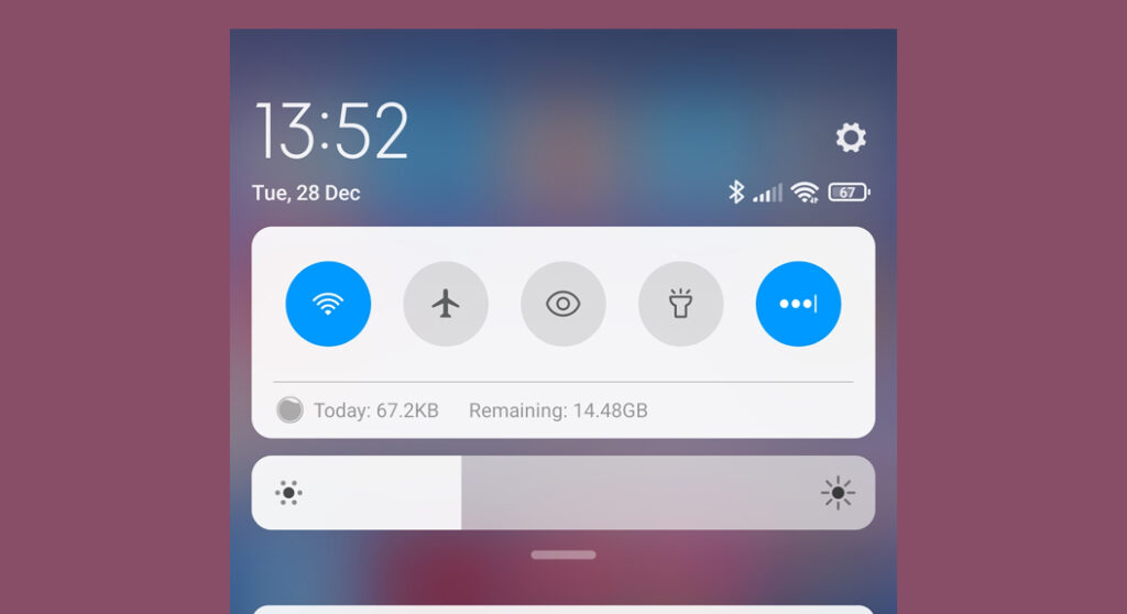
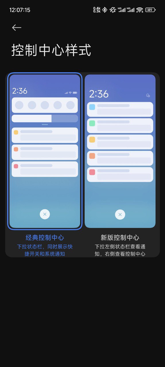
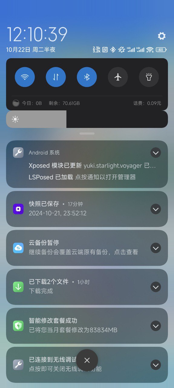
The upcoming update of HyperOS 2.0 may kill the old-style Control Center, as for quite a long period, it reminded them of MIUI 11. Those users who have been more connected to this classic layout have complained about long-standing issues on the HyperOS Enhanced Beta update, which is taken as preparation for the official release of HyperOS 2.0.
One specific complaint with the beta update right now deals with a major breakage of the classic Control Center.
The old A15 HyperOS 1.1 control center is almost unusable and can’t be pulled down, with the brightness bar in some weird position while obstructing other functions. These layout bugs and usability issues suggest that maybe Xiaomi will finally bury this older style completely with the full release of HyperOS 2.0. Not fixing the bugs, especially after users’ input and reports on them, points toward a shift in favor of more modern design and leaving the classic control layout behind.
Meanwhile, on the launch date, HyperOS 2.0 will be officially announced on October 29. Until then, Xiaomi fans should be very excited to see whether it will affect the user experience, both in terms of design, style, and functionality of the interface. Will the beloved but outdated Control Center style go out? Only time will tell. Stay tuned as the launch date approaches!

 Emir Bardakçı
Hyper os is the best
If it is possible, it will be great because some devices like Poco c65 and Redmi 13c still use the old design
I hope it is like that please haha
E o Redmi note 11 pro 5 g versão RKCEUXM veux morreu?
yeyyyy, been waiting for this for a long period of timeeee and now it’s happening!!!!
Hi. I would like to know why the Redmi 13 was stuck in the old Control Center, despite being a relatively new device and bringing HyperOS by default. The same thing happens with the NO update to HOS 2.
Exactly! There’s no point in putting a nice theme on your phone if the Control Center is still the same old small thing. The theme may give the overall look a good boost, but the Control Center is what you use all the time to do the basics, so if it’s not up to par, it breaks the whole look.
Just imagine: putting on a top theme, all stylish, and still having a large, well-designed Control Center? That really transforms the phone, both in terms of appearance and usability. Xiaomi needs to understand that important functions like this can’t be left out of some models.
If this change comes with HyperOS 2.0, it will be perfect! It has to match the design of the system with the themes, otherwise it looks like a patch, doesn’t it? So, the Control Center has to keep up with this modernization so that everything lines up and leaves your phone looking like you’re proud to use it!
Do away with this old power station 🙌
Nice
The old one is the best. I hate the new one
Redmi 12 plz anibal control center
Is it available for xiaomi 14 ultra in India
That would be stupid, old one is more user friendly and doesn’t force you to swipe from left or right side, depending what you want to access. It’s faster to use and more clear design. I would switch to another brand next contract if they remove it.
I hope the battery consumption of 13T Pro will decrease
Status for control centre change control centre change
Please always display
Please bring back split screen on redmi12c , away with the old control center
We need update as soon as possible.
I love Xiaomi Brand. I am redmi 13 user.. redmi.It’s model is hyperos…When I update this phone notification control gone.I don’t like old control.. Please update hyperos on redmi 13 device for new notification control….
I seriously despise this oversized control center, the classic menu lets you see ALL your important settings AND notifications at once, with a simple gesture. At least have the option to choose between the two styles as on HyperOS 1.0 :'(
I upgraded my redmi A3 pro from Android 14 to 15 hyperOS 2.0, yet the old android
control centre is still there.
Fuck I moved away iOS and now they’re forcing an iOS-ripoff experience down our throats.
redmi 14c 5G my phone old control center please new control center update