

 Emir Bardakçı
3Xiaomi has always been known for taking inspiration from the best in the tech industry, and with the arrival of HyperOS 2, users are noticing some familiar design elements that look almost identical to Apple’s iOS 26. From system icons to unique interface animations, Xiaomi seems to have borrowed a series of ideas while adapting them into its own ecosystem. You can explore our latest HyperOS 3 coverage or discover hidden Xiaomi features through our MemeOS Enhancer app.
Familiar designs in HyperOS 3
While Xiaomi puts its own polish on software, several similarities to iOS 26 are hard to miss. The most noticeable changes appear in visual design, app layouts, and certain animations that mirror Apple’s style.
1. Liquid glass design
The new launcher and gallery adopt a liquid glass effect, closely resembling Apple’s refined translucent backgrounds. This gives the interface a premium appearance, though it feels highly familiar to iOS users.


2. Weather app icon
The Weather app icon now adopts the flat, bright color tones seen in iOS 26, with a clear sun-cloud combination.


3. Dynamic Island
Xiaomi has expanded its interactive notification area, taking cues from Dynamic Island, offering smooth transitions for calls, music, and system alerts.


4. New albums feature
The Gallery app now offers an “auto-sorted albums” feature, reminiscent of iOS photo organization, automatically grouping people, pets, and events.

5. Dialer and Messages icons
Both Dialer and Messages icons have shifted to rounded shapes with solid colors, mirroring Apple’s minimalistic design philosophy.

6. Calendar app design
The Calendar app now features a cleaner white background with bold day indicators, strongly echoing Apple’s approach.


7. Face ID animations
Unlock animations for Face Unlock have been redesigned with circular wave motions nearly identical to iOS 26’s Face ID visuals.


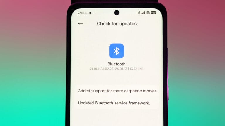
8. Control center icons
The Control Center includes redesigned icons for Bluetooth, flashlight, and brightness, all adopting Apple-like rounded toggles.


9. Signal and Wi-Fi icons
Even the signal bars and Wi-Fi indicators have been tweaked to look closer to the minimalistic iOS 26 versions.


10. Overall polish
Taken together, these changes add up to a familiar experience. While Xiaomi markets these updates as fresh, many users will immediately notice their Apple-inspired origins.
Source: Apple Design


why copying Apple?
pls release fast guys….
how to set this on my Redmi 12 5 G
I’m sorry but for control center I prefer Apple because you can customize it wherever you want instead of Xiaomi and Samsung were you’re forced
Note that,Apple Copied Dynamic island from Huawei magic capsule.
it’s not like that Apple don’t copy anything.
apple copied many things
Dynamic Island – Huawei (Magic Capsule)
Removed 3.5 mm jack – Copy oppo idea
Liquid Glass – Windows & Xiaomi
Face id – Xbox
Wireless charging – Samsung
Notch – Essential phone
New Capture button – Sony
You can customize Samsung control center too. You can change the position of the controls like WiFi/Bluetooth and Volume etc. , change what quick settings you want to show immediately and how many rows of them you want to show before expanding (they even did expand on my OnePlus 6 or 7? can’t remember..). It’s not as flexible as Apple’s but still way better than Xiaomi’s.
All you can change is adding more/less of them. If you add too many or show the text for the quick settings you have to swipe up twice because first one will just scroll everything up and gets stuck (or only once, once you figured out that if you swipe near the edges it will close it immediately.) The experience and customisation is just bad. No idea about HOS 3 tho
Most of them weren’t needed, but compared to Apple’s copying, these are nothing.
Also, ‘Ajdar Anık – the world superstar’ didn’t go unnoticed 😂
Is this available for 14c? if yes, when can I update my phone?
Redmi 14c 5G my phone is not control centre new please New update fix
This is embarrassing.
Hey, you’re making too many comparisons, let alone completing the HyperOS 3 update on the Indonesian/Global version of the F7, you haven’t even finished it yet, hurry up and make this comparison, that’s hilarious.🤔🥴🥴
Why work? Just copy and done! 🙂↕️
hi how are you going I am good I am so happy with the new update byee
They shoud copy Apple’s way of updating devices.